Line charts plot your data set as a series of data points connected by straight lines, along Cartesian coordinates. Line charts are commonly used to plot trends over time but are useful in other scenarios as well.
- On the ribbon, click the Components tab to see Chart Design
Basic Line Chart
The following example shows a basic line chart that plots Categories by Values and can use Color and Shape to filter the visual and create a combined color and shape legend (purple highlight below):
Building the Line Chart
Before you begin
Create a new discovery from the User Hub, App Tabs, or on the right-click in the Content Explorer. As part of this process, you will need to open the appropriate Data Model for your analysis. For more information, see Access Discover Pro.
Step 1: Create your Basic Visual
To set up the basic visual:
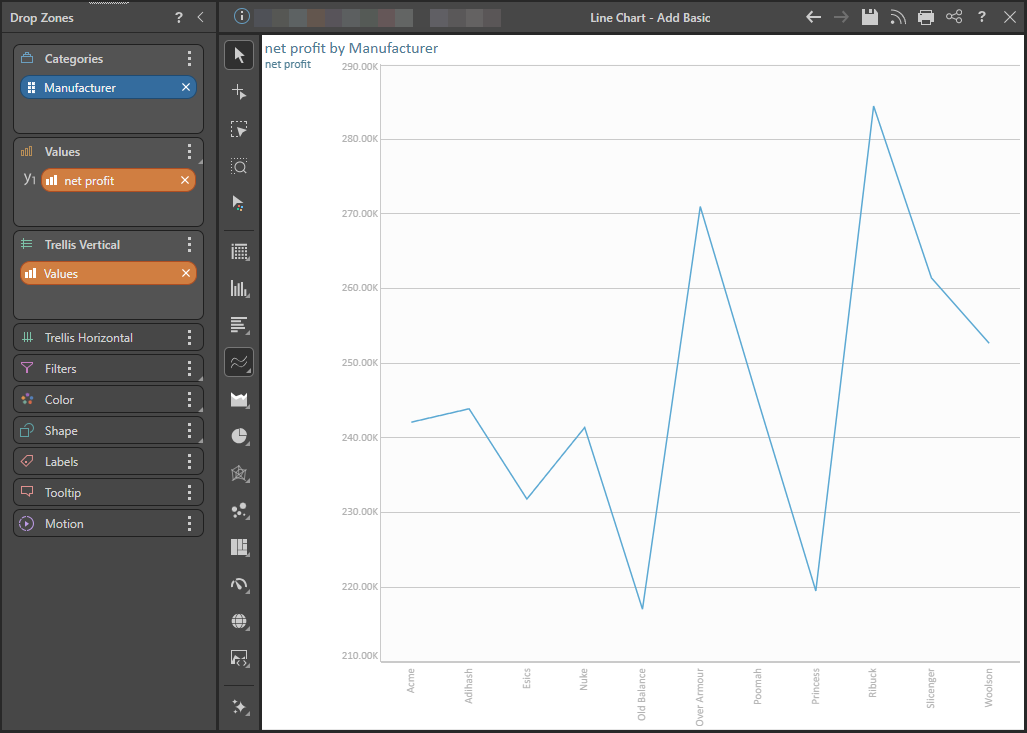
- Add at least one measure by double-clicking or selecting it in the Measures panel.
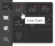
- From the Toolbox, right-click the Line Chart option and select the chart type you require from the submenu.
- Add at least one hierarchy by double-clicking it in the Dimensions panel.
The measure is added to the Values drop zone.
Tip: You can view the names of the available visualization types by hovering your cursor over the items in the submenu.
The hierarchy is added to the Categories drop zone.
If you selected Line Chart, a basic line chart is created that plots the data points representing the value for each hierarchy element:
Step 2: Add More Hierarchies
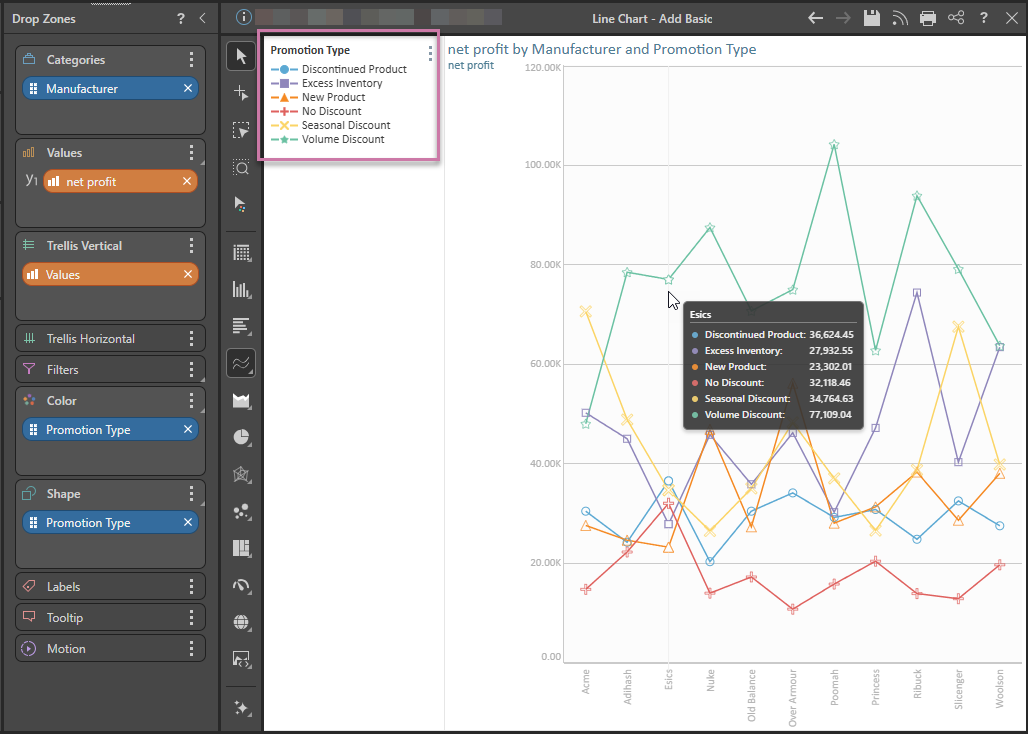
You can plot multiple hierarchies in your line chart by adding a second hierarchy to the Color or Shape drop zones. In this example, a second hierarchy is added to both Color and Shape (green highlight below). This produces a combined color and shape legend (purple highlight) and adds shapes to the data points that can be seen on hover (orange arrow):
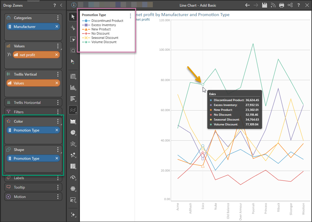
Tip: If you want to see the data points all the time, as in the example at the start of this topic, you can enable them from the Components ribbon or in the Shapes Formatting panel. For more information, see Data Points.
Examples: Other Line Charts
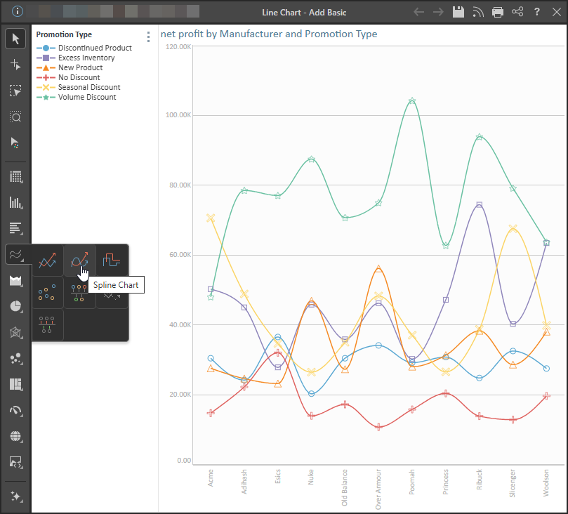
Spline Chart
The spline chart is identical to the line chart in terms of functionality. The difference between the two is cosmetic, with the Spline chart connecting each data point with a curved line rather than a straight line.
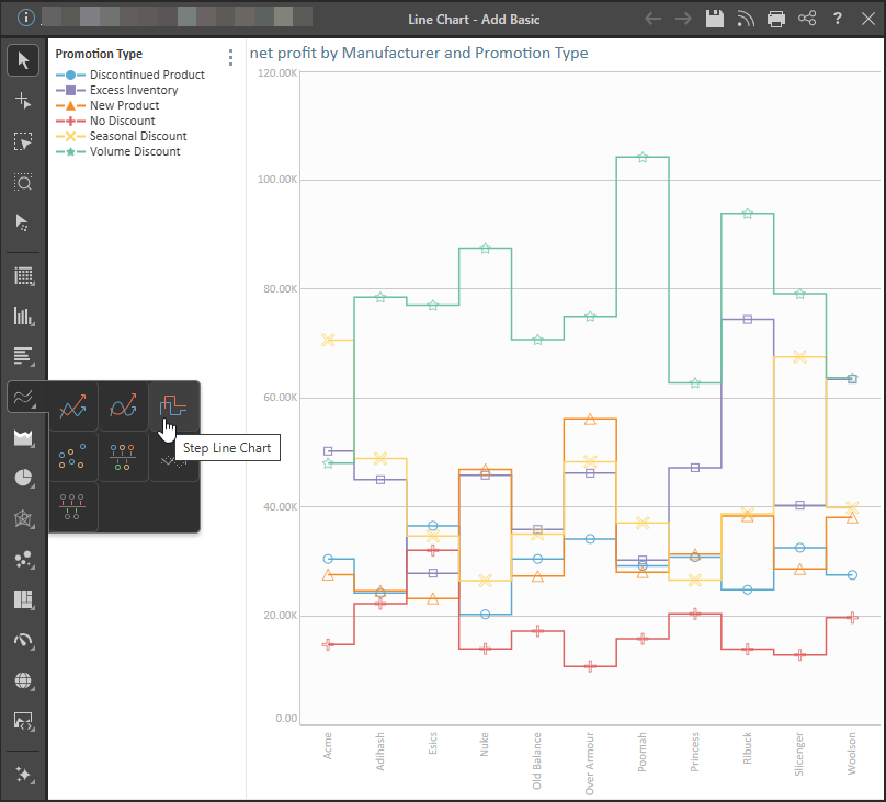
Stepped Line Chart
The stepped line chart is another variation on the line chart. The difference here is that the data points are connected by steps rather than a straight line. This can make it easier to read the chart accurately. The stepped line resembles the shape of a column chart, with a straight horizontal line through each data point, and a straight vertical line between each hierarchy member.